


A great marketplace is not just about features — it’s about experience.
In a multi-vendor platform built with WordPress, WooCommerce, and Dokan, the vendor dashboard plays a critical role.
If vendors find the dashboard confusing or slow, they will:
❌ Struggle to manage products
❌ Make mistakes in orders
❌ Leave your platform
👉 Better UI/UX = better vendor retention and growth
In this guide, you’ll learn how to improve Dokan vendor dashboard UI/UX for better performance and usability.
🔴 Why Vendor Dashboard UX Matters
The vendor dashboard is where sellers spend most of their time.
Poor UX leads to:
❌ Frustration
❌ Errors in product management
❌ Lower productivity
Good UX provides:
✔ Faster workflows
✔ Better decision making
✔ Higher vendor satisfaction
✔ Increased sales
👉 UX directly impacts marketplace success
🧠 Common Problems in Dokan Dashboard
Many marketplaces face these issues:
❌ Cluttered Interface
Too many options confuse vendors.
❌ Slow Performance
Heavy queries make the dashboard laggy.
❌ Poor Navigation
Vendors struggle to find features.
❌ Lack of Insights
No clear data for decision-making.
❌ Mobile Unfriendly
Dashboard not optimized for mobile devices.
👉 These issues reduce vendor efficiency.
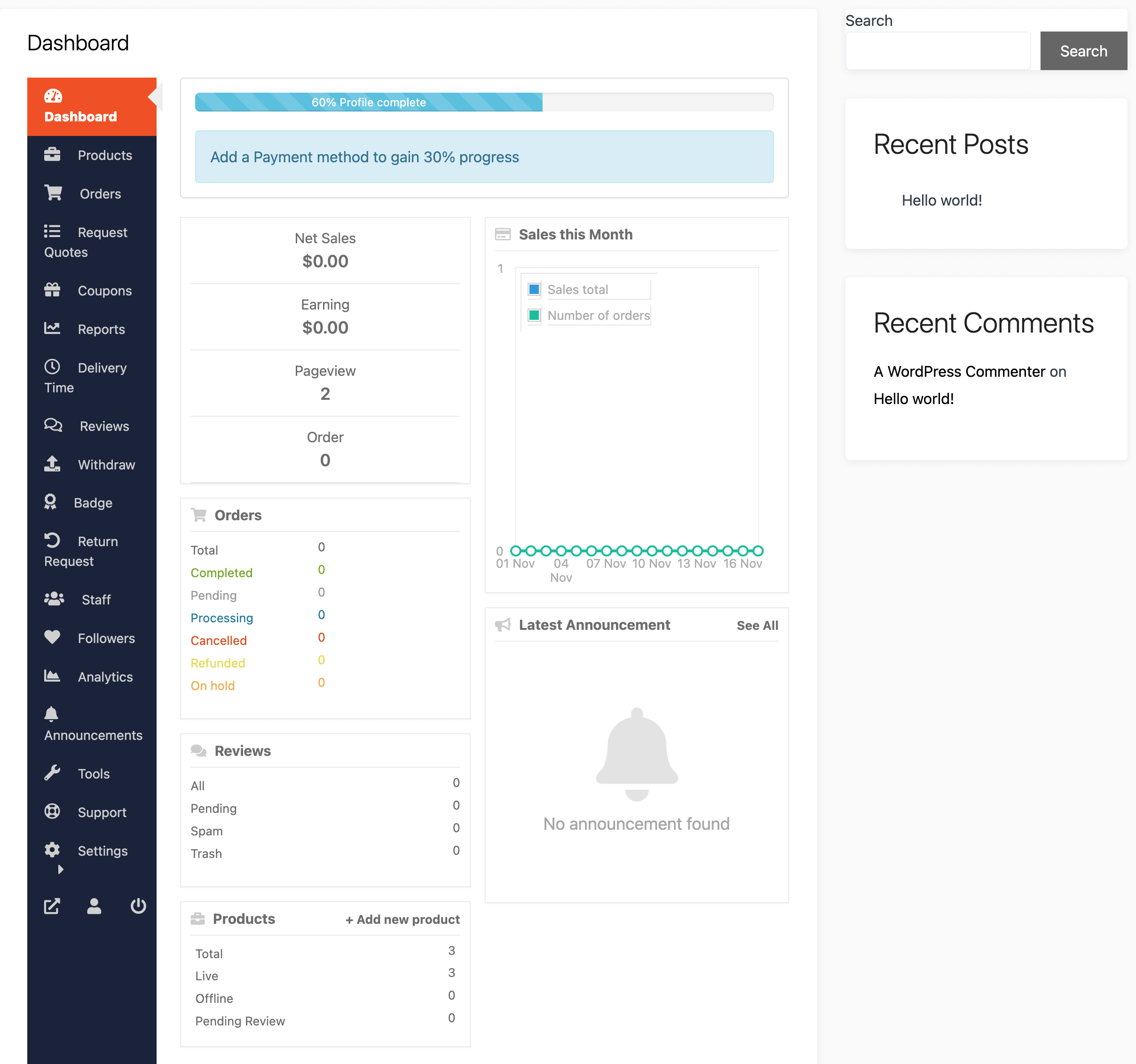
⚙️ 1️⃣ Simplify Dashboard Layout
A clean layout improves usability.
Best practices:
✔ Remove unnecessary elements
✔ Use clear sections
✔ Add spacing and alignment
✔ Highlight key actions
👉 Focus on clarity over complexity
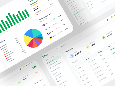
📊 2️⃣ Add Actionable Analytics
Vendors need quick insights.
Add:
✔ Sales overview
✔ Order statistics
✔ Revenue trends
✔ Top products
👉 Data helps vendors make better decisions.
🧭 3️⃣ Improve Navigation
Navigation should be intuitive.
Improve by:
✔ Grouping related items
✔ Adding icons for menus
✔ Using collapsible sidebar
✔ Highlighting active pages
👉 Vendors should find anything in 1–2 clicks
⚡ 4️⃣ Optimize Performance
Slow dashboards kill productivity.
Improve performance:
✔ Optimize database queries
✔ Use caching
✔ Reduce unnecessary scripts
✔ Lazy load data
👉 Faster dashboard = better experience.
🛒 5️⃣ Enhance Product Management UI
Product creation should be simple.
Improvements:
✔ Better form layout
✔ Inline validation
✔ Image upload preview
✔ Category selection improvements
👉 Reduces vendor errors.
📦 6️⃣ Improve Order Management
Order handling must be easy.
Add:
✔ Filters (status, date, product)
✔ Quick actions (approve, ship, cancel)
✔ Bulk actions
✔ Clear order status
👉 Saves time for vendors.
📱 7️⃣ Mobile Optimization
Many vendors use mobile devices.
Ensure:
✔ Responsive design
✔ Touch-friendly buttons
✔ Fast loading
✔ Simplified mobile UI
👉 Mobile UX is critical in 2026.
🔔 8️⃣ Add Smart Notifications
Keep vendors informed.
Notify about:
✔ New orders
✔ Low stock
✔ Messages
✔ Payments
👉 Improves engagement.
🎯 9️⃣ Use UX Enhancements
Small changes make big impact:
✔ Tooltips for guidance
✔ Progress indicators
✔ Confirmation messages
✔ Error handling
👉 Improves usability.
🎨 🔟 Customize UI Design
Make dashboard visually appealing:
✔ Use consistent colors
✔ Improve typography
✔ Add icons and visuals
✔ Use modern design principles
👉 Better design = better perception.
📈 Real Impact of UI/UX Improvements
After optimization:
✔ Faster vendor onboarding
✔ Increased product listings
✔ Higher sales
✔ Better retention
👉 UX improvements directly increase revenue.
🚨 Common Mistakes to Avoid
❌ Over-designing dashboard
❌ Ignoring performance
❌ Too many features
❌ No vendor feedback
❌ Poor mobile experience
👉 Keep it simple and fast
📌 UI/UX Improvement Checklist
✔ Clean layout
✔ Better navigation
✔ Fast performance
✔ Mobile-friendly
✔ Improved product & order UI
✔ Analytics dashboard
👉 Follow this for best results.

Hire Me on Upwork – Dokan & WooCommerce Expert
