
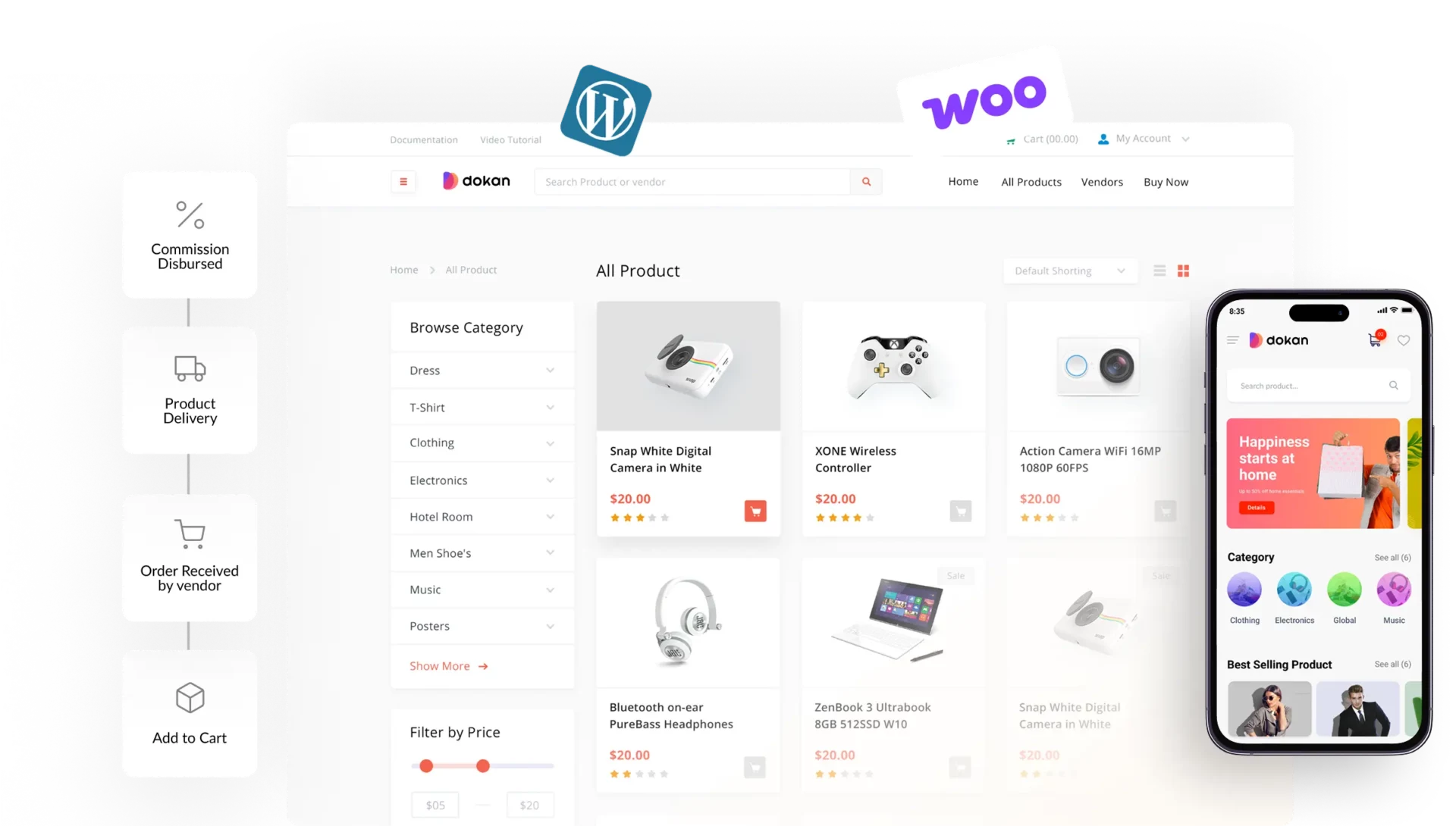
In 2026, more than 70% of users browse and shop from mobile devices. If your marketplace is not optimized for mobile, you are losing traffic, vendors, and revenue.
If you are running a marketplace using WordPress, WooCommerce, and Dokan, mobile optimization is no longer optional — it’s essential.
In this guide, you’ll learn how to optimize your Dokan marketplace for mobile devices step-by-step.
🔴 Why Mobile Optimization Matters
Without mobile optimization:
❌ High bounce rate
❌ Poor user experience
❌ Low conversions
❌ Lost sales
With proper mobile optimization:
✔ Better user experience
✔ Higher conversions
✔ Faster loading
✔ Improved SEO
👉 Mobile UX = growth driver for your marketplace
🧠 Common Mobile Issues in Dokan
Many Dokan marketplaces face:
❌ Non-Responsive Design
Layouts break on small screens.
❌ Slow Loading
Heavy pages take too long to load.
❌ Difficult Navigation
Menus are hard to use on mobile.
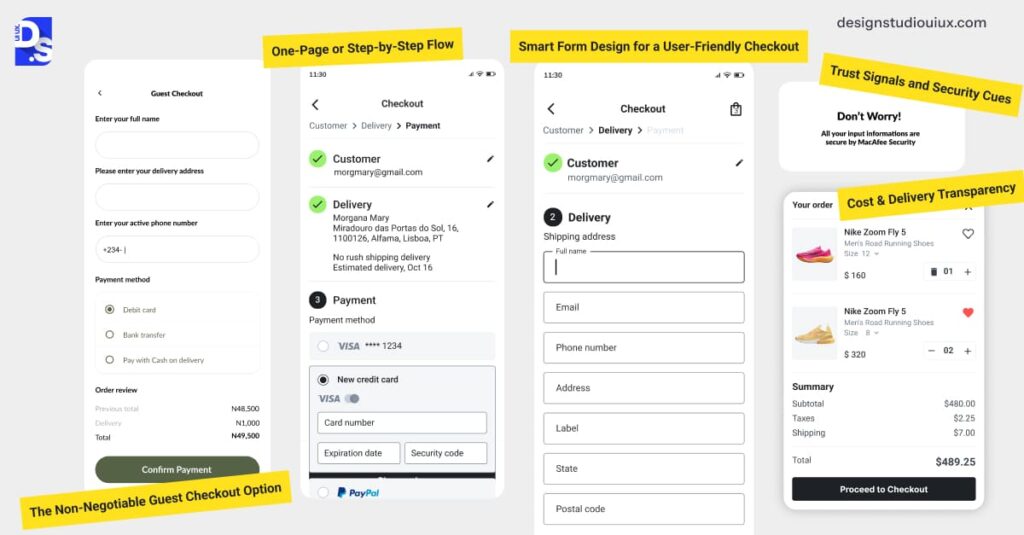
❌ Poor Checkout UX
Forms are not optimized for touch.
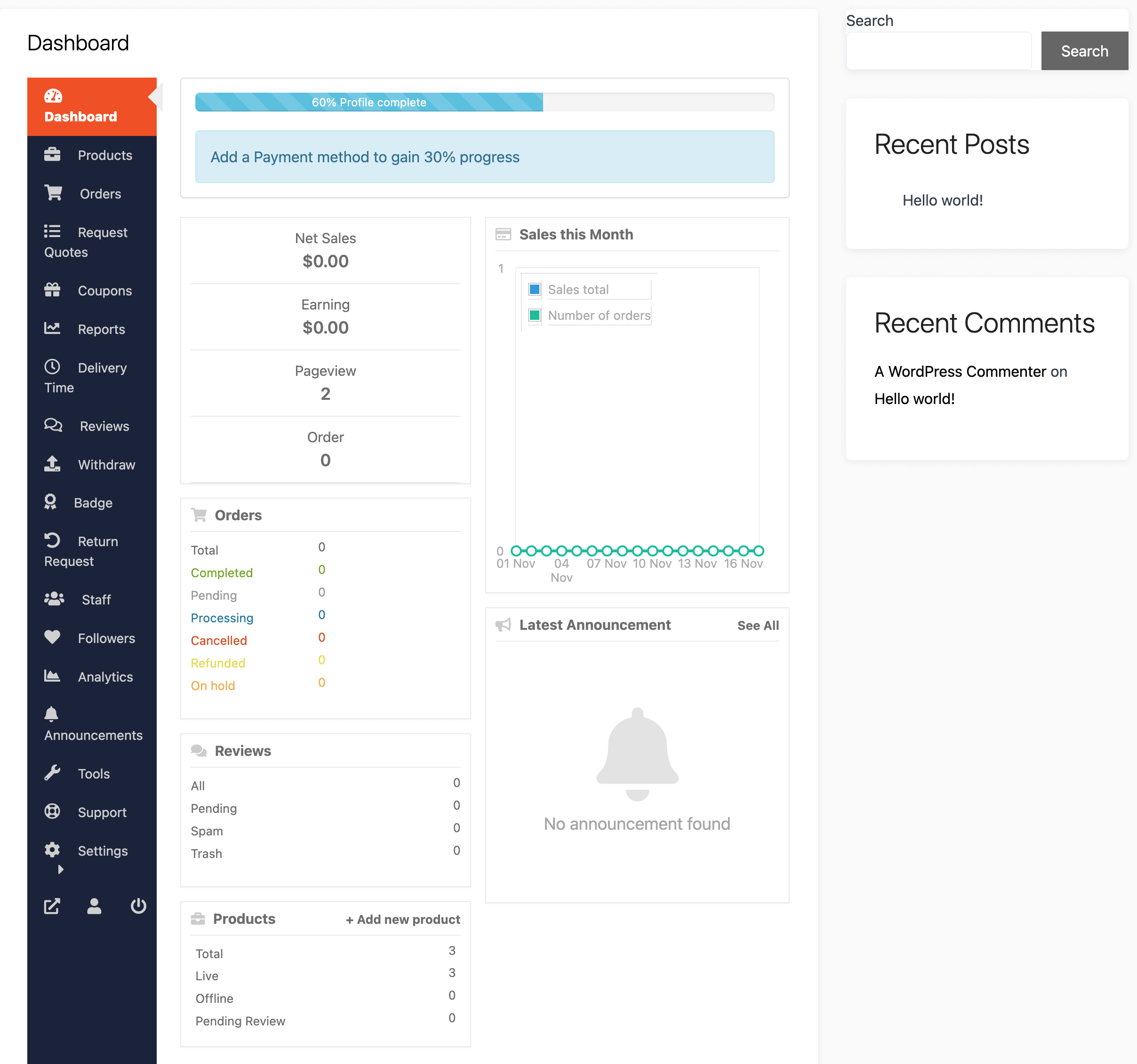
❌ Vendor Dashboard Issues
Not usable on mobile devices.
👉 These issues reduce engagement and sales.
⚙️ 1️⃣ Use a Mobile-Responsive Theme
Choose a theme optimized for mobile.
Best practices:
✔ Lightweight theme
✔ Fully responsive design
✔ Fast loading
Examples:
- Astra
- GeneratePress
👉 Foundation matters.
📱 2️⃣ Optimize Mobile Navigation
Mobile navigation should be simple.
Improve by:
✔ Hamburger menu
✔ Sticky navigation
✔ Large clickable buttons
✔ Clear categories
👉 Easy navigation = better engagement.
⚡ 3️⃣ Improve Mobile Speed
Speed is critical on mobile.
Optimize:
✔ Image compression
✔ Lazy loading
✔ Caching
✔ Minify CSS/JS
✔ CDN usage
👉 Faster sites convert better.
🛒 4️⃣ Optimize Product Pages
Product pages should be mobile-friendly.
✔ Clear product images
✔ Swipe gallery
✔ Easy-to-read content
✔ Sticky “Add to Cart” button
👉 Improves buying experience.
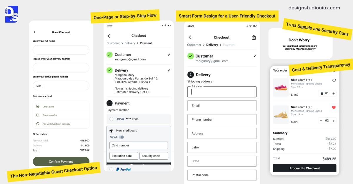
💳 5️⃣ Optimize Checkout for Mobile
Checkout is where conversions happen.
✔ Simple forms
✔ Autofill support
✔ One-page checkout
✔ Mobile-friendly payment methods
👉 Reduce friction at checkout.
📊 6️⃣ Optimize Vendor Dashboard for Mobile
Vendors also use mobile.
Improve dashboard:
✔ Simplified layout
✔ Large buttons
✔ Quick actions
✔ Mobile-friendly reports
👉 Better vendor experience.
🔔 7️⃣ Add Mobile Notifications
Keep users engaged:
✔ Order updates
✔ Delivery alerts
✔ Promotions
👉 Improves retention.
🎯 8️⃣ Use Mobile-Friendly Forms
Forms should be easy to fill.
✔ Fewer fields
✔ Dropdowns instead of typing
✔ Numeric keypad for numbers
👉 Improves conversions.
🔐 9️⃣ Ensure Security & Trust
Mobile users need confidence.
✔ SSL (HTTPS)
✔ Secure payment icons
✔ Clear policies
👉 Builds trust.
🚀 🔟 Test & Optimize Regularly
Test your marketplace on:
✔ Different devices
✔ Screen sizes
✔ Browsers
Use tools:
✔ Google Mobile-Friendly Test
✔ PageSpeed Insights
👉 Continuous improvement is key.
📈 Real Impact of Mobile Optimization
After optimization:
✔ Lower bounce rate
✔ Higher conversions
✔ Better SEO ranking
✔ Improved user satisfaction
👉 Mobile optimization directly increases revenue.
🚨 Common Mistakes to Avoid
❌ Ignoring mobile users
❌ Heavy design elements
❌ Poor navigation
❌ Slow loading
❌ Non-responsive dashboard
👉 Keep it simple and fast.
📌 Mobile Optimization Checklist
✔ Responsive theme
✔ Fast loading
✔ Mobile-friendly navigation
✔ Optimized checkout
✔ Vendor dashboard usability
✔ Regular testing

Hire Me on Upwork – Dokan & WooCommerce Expert

 Chat on WhatsApp